
For a little while now I’ve been thinking a lot about colour. Super-keen readers might recall a blog I wrote last summer about House and Garden Magazine in the 1960s, which you can read here, or, more recently, about fabulous Living in Vogue (I hope you found your copy).
And when I was also writing, and therefore thinking about, the text of my own book on English Decoration, I was thinking about colour a lot. In fact the presence of extraordinary jolts of colour, when you are least expecting them, is I think possibly one of the characteristic things about the book.
Well, then you combine all of that with some crazy posts recently by my friend Ruth Guilding on her increasingly fabulous Bible of British Taste (forgive me Ruth for stealing your photos):


and you can see where I’m coming from. Insane. Yes, it’s time to liven up our lives a bit.
So, I’ve been thinking about a bit of a repaint at the Old Parsonage, here and there. Sharp eyed readers will again have already seen the results of some of this itchy-feet-time-to-get-colourful mood, when my kitchen went from being white:

to dark orange:

See what I mean? It took a bit of getting used to, but a change is better than a holiday I sometimes think. And I love my dark orange walls (Farrow & Ball Wet Sand, before you ask).
Now when I’ve been thinking about paint, a little book that I picked up years ago in a second hand shop has also been on my mind. A Tint Book of Historical Colours Suitable for Decorative Work… published by Thomas Parsons & Sons, in the early 1950s. When I found that book, it was just one of those things that was nice enough not to leave on the shelf.


Inside, the pages are filled with beautifully crafted colour charts, of historically inspired colours, each drawn not from old paint colours as such, but from the tones of Oriental ceramics, or Mortlake Tapestries, or Aubusson Carpets and so on.


Can you imagine such production values today?
Anyway, I didn’t think much more about it, and for a long time that book was tucked away somewhere down in Dorset. I found it again the other day, and I think it was all part of my general interest in slightly stronger, richer, cleaner colours.
Farrow & Ball is brilliant – there’s no doubt. It’s been my mainstay for years. I reckon there’s only so many paint charts you can keep in your mind, and there’s nothing like good old reliable.
Well, I wish WISH WISH (Farrow & Ball, I hope you’re reading) that they would stay super reliable, and not discontinue colours on the chart. You will know, as all the cognoscenti do, of course, that you can order any of the archive colours if you like, the ones that have been discontinued, just by calling them up… (Wet Sand, in my kitchen, for instance) but what a bore. I’ve now got about 6 Farrow & Ball cards of various ages, and I can’t get rid of any of them, because each has a colour or two on it that the others don’t. ANNOYING. Really annoying.

(elusive Wet Sand, bottom left)

(elusive Berrington Blue and Mere Green, bottom right)

(Elusive Pantalon, bottom right – one of my all time favourite Farrow & Ball colours, no longer on the current chart… the colour of my old kitchen in Great Ormond Street, for those Ben P flat nerds who are interested)

My beaten and battered original F&B colour chart. Hand painted samples in those days, I might add, instead of the rather substandard items they provide you with today:

Not the same thing at all, I’m sure you’ll agree. It’s all very well being ubiquitous, but quality standards are important… If someone clever at Farrow & Ball wanted to be really clever… they’d issue a nice hand painted chart with every single colour on it and they’d charge a lot of money to people like me for it.
But really, I don’t have a gripe with Farrow & Ball. I know it’s fashionable to diss them, or to say “My painter thinks the quality is rubbish” or things like that at west London dinner parties. No, my problem is a bit more fundamental. I’m afraid I’m getting bored by all those 50 shades of grey.
Step in Papers & Paints, by Patrick Baty. For those of you who don’t know, this funny little paint shop has been offering something a little different since the 60s. I don’t really know Patrick Baty, although I think I glimpse him across the room from time to time at Georgian Group parties and things like that – you’re right, not always the most glamorous event in London, despite what members of the Georgian Group might think about themselves (although they have a certain unidentifiable quality that you find no where else in the world. My favourite moment of all at a Georgian Group dinner? As the speeches were about to start…. the room silent with anticipation… to be broken by the sound of Ruth Guilding (of Bible of British Taste) lighting a unfiltered cigarette held in a 6″ long black cigarette holder. A couple of years after the smoking ban. Ruth is of course at her best at moments like this).
Anyway, back to Patrick Baty. Reading his texts on paint, on his very informative blog and website, I sometimes detect a slightly stringent tone, which sort of says “REALLY, believe me, I know more about this subject than you or in fact anyone ever will” which is probably true, when you come to think about it. He does know a lot of paint. So much so, that I sometimes feel a bit grateful that we’ve never sat next to each other… it could get a bit intense.
Years ago, my great friend Johnny Holland, now of course a fantastic architect, worked, I believe, in Patrick’s basement producing their inimitable hand-painted paint charts. Day after day Johnny turned up for work in the shop and painted hundreds of cards with lemon colour, then Medici Green, then Chocolate No. 1, and on, and on, and on. It sounded like rather gruelling work. But worth it… these paint charts do give Farrow & Ball a run for their money. See what I mean?

And… check out the colours! These are from the 1950s range… which formed the staple colours in the shop when it was founded by Patrick’s father (I think I have that right) in 1960. They are brilliant.

They include these two, at the bottom of the page, which is my stair hall (5-063) and Kitchen (4-050) in my new flat in London. Phew, that answers a recurring question that appears from time to time in the comments pages of the website. (while we’re on the case, my kitchen cabinet knobs are A57 brass knobs from Optimum Brasses… for whoever wanted to know that answer about 9 months ago somewhere and I am sorry I have never replied sooner).
Or, this colour:

1-020, the pink one in the middle, which sometime this spring or summer is going to become my new sitting room colour in Dorset.
Meanwhile, will you check out these?

Perfect. And, in the way that circles nicely complete from time to time – they are a fairly complete reproduction of the Thomas Parsons & Sons Tint Book that began this blog. Good old Papers & Paints. I’m dreaming of a turquoise bedroom corridor in London, of a dark chocolate bedroom and moss-green bathroom in Dorset, of Kelly Green kitchen cabinets in gloss paint at Queen Square – it’s time to turn up the paint volume, and have some fun.

For the neo-Georgians amongst you, Baty has a very splendid range of ‘Traditional Colours’, complete with requisite Drabs and dulls, as well as the brighter shades shown here.
On his blog, I found this tantalising image.

Check out the right hand sheet… The 1960s colours… which I don’t yet have (if someone really smart at Papers & Paints is reading this blog right now, and something tells me that they are, the office address is 49 Lambs Conduit Street, WC1N 3NG…) HELLO COLOUR. That green! That purple!
Of course the funny thing is, that I’ve also re-fallen in love with the thing that started it all, the British Standard Colours which (Patrick will correct me) were set up, I think, in the 50s.
Here’s an original BS card, image borrowed from Patrick’s website.

Here’s my slightly battered but extremely useful Crown Trade chart from today.

Nice and simple, nice and cheap, and packed full of scintillating colours. What more could you ask for? Good old British Standards. They may be falling in other walks of life (Liberal Democrat sex scandal, anyone, or Educational standards amongst 16 year olds, or even AAA ratings-whatevertheyare?)…
But not in paint.
-
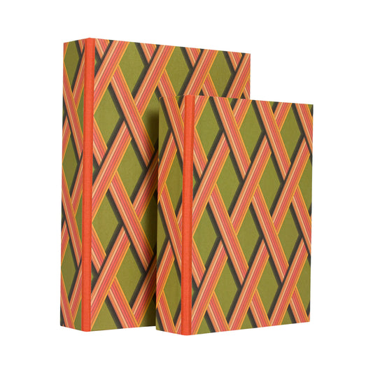
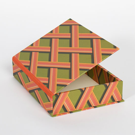
A5 Boxfile - Bright Olive Trellis Work
Vendor:Pentreath & HallRegular price £ 30.00Regular priceUnit price per -
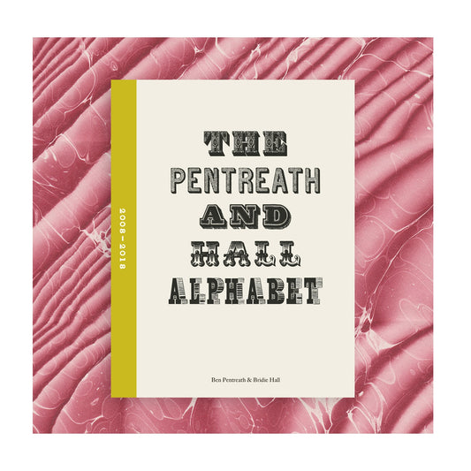
The Pentreath & Hall Alphabet Book
Vendor:Pentreath & HallRegular price £ 30.00Regular priceUnit price per -
Antique Intaglios on Chocolate Paper
Vendor:Parvum OpusRegular price £ 6.50Regular priceUnit price per -
Bay & Rosemary Caesar Soap - CALIGULA
Vendor:Bridie HallRegular price £ 8.50Regular priceUnit price per