
I don’t know about you, but I’m not quite sure what to make of the News of the World debacle. Good riddance the evil Murdoch empire, maybe? Sad that our Sundays will not be quite so interesting? A little while ago, we were quite surprised in the architecture office when our project in Truro made it to page 17, for reasons that I will go into another day.
Amongst all the noise, I would merely like to have a moment to mourn the passing of the last decent typeface on Fleet Street. I have quite a thing for large scale 19th century type; so much more descriptive, so much bolder, more interesting, richer, than the diminished alternatives that are displayed on other, more bland mastheads.
![]()
If, like me, you are inspired by that good old fat face, here are a few suggestions (Figgins Brute, Clarendon, Egyptian MT):


For an even better alternative, may I recommend the perfect wesbite of Hoeffler & Frere-Jones, www.typography.com, and their superb Ziggurat font, shown below. Heaven on a page. RIP, News of the World. May your tombstone be handsomely carved.


-
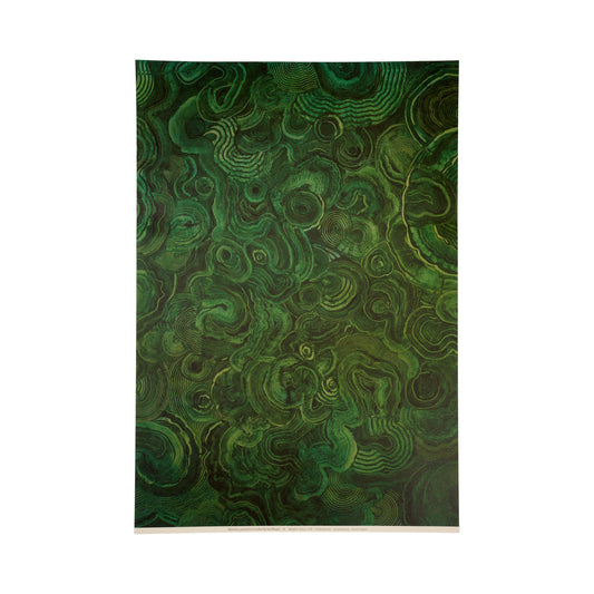
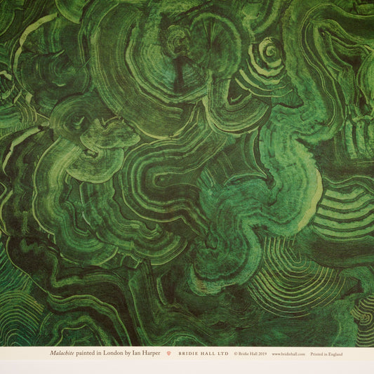
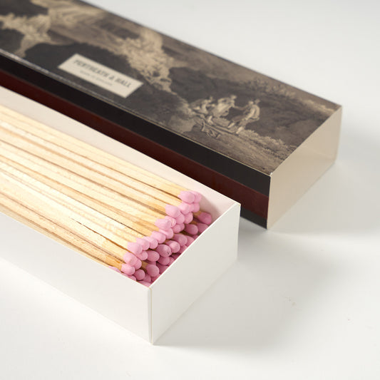
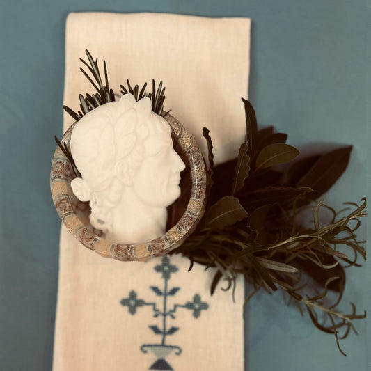
Malachite Patterned Paper
Vendor:Pentreath & HallRegular price £ 6.50Regular priceUnit price per -
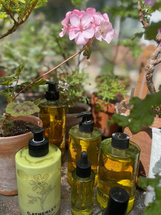
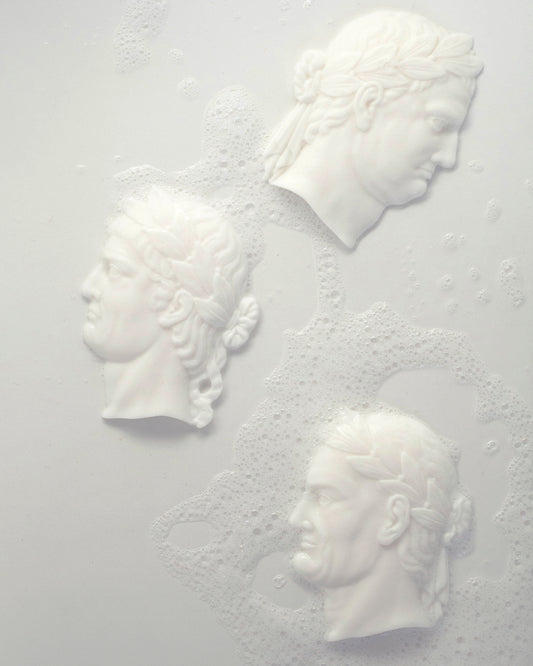
Geranium No. 2 Body Wash - 500ml
Vendor:C. AtherleyRegular price £ 29.00Regular priceUnit price per -
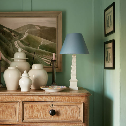
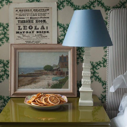
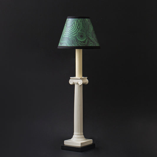
P&H Creamware Obelisk Lamp
Vendor:Pentreath & HallRegular price £ 265.00Regular priceUnit price per -
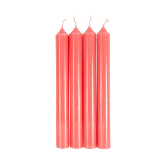
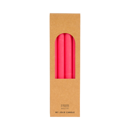
Rose Clair Dinner Candle - pack of 12
Vendor:My Jolie CandleRegular price £ 22.50Regular priceUnit price per